I enjoy a particular brand of coffee in Australia, namely Campos.
It is a rich blend and yes, I suppose I’m “a coffee snob!” (Can’t bring myself to drink that Starbucks or Gloria Jean’s stuff I’m afraid!)
Campos coffee has stolen a huge marketshare in Australia in recent years, by positioning itself as a “premium coffee brand”- only providing its beans to selected cafes who meet a certain criteria.
In other words, it’s trying to position itself as “coffee snob’s coffee!”
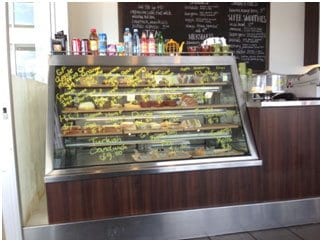
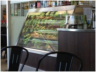
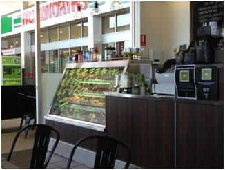
It came as a big surprise to me recently, wherein during a snob’s coffee at a Gold Coast café to see the terrible “floral signage” on the cakes and patisseries display cabinet.
Have a look at the photos here and you’ll see what I mean.


On one hand, this cafe is promoting the fact that it serves “Campos snobs coffee”- and yet on the other hand it’s carrying out of its way to make the café look like Bi Lo, the cheap super market chain!
If your business is targeted at “snob” (let say “people who are willing to pay a few dollars more for quality”), this is not the thing to do!
Those who are around my environment know that I preach the virtues of “message to market match.”
In other words, make sure that the demeanour of your message matches the personality of your target audience.
And on this occasion, this café has got it all wrong.
Given that the cafes “cakes and patisseries” is a first thing you see when you walk into the establishment, this “Director Of First Impressions” has failed miserably, giving the worst possible impression one could.
The lesson for all of us here is to make sure that we give appropriate importance to “signage” and “ambiance” if we have a bricks and mortar business.
I’m constantly amazed (and amused!) with bricks and mortar businesses (particular retail hospitality) that fail to recognise the absolute importance of “good signage.”
Do yourself a favour and make sure your Director Of First Impression gives the right impression!
Consequently the franchise store undertook an exciting “French-style“ makeover, experimenting with a few locations to start with.
To say that the cafés went from “bland to grand” would be an understatement.
The franchise store did a fabulous job and bring a “coffee snob” myself, I took particular notice of this terrific transformation.
Previously the Michelle’s Pottery Cafés had “a hint” of a French in flaunts, that nowhere near enough in my books.
But with this transformation, they have gone “fully French” and created an incredibly tasteful European ambiance..….. and apparently the results happen fabulous.
In other words, the franchise store realised it was time “for a makeover.”
Have a look at the before and after the photographs here and you’ll see the incredible difference such as face lift makes, both from a presentation view point and from a revenue perspective!
Let’s face it, business is all about caving out with the times-so regardless of online or offline business, take five minutes out and think about whether your business might need a makeover.
Sometimes we all became “store blind” and not realise that we have fallen into the “bland category.”
Remember, to make a difference, you have to be different!


